GINDI MARKETING
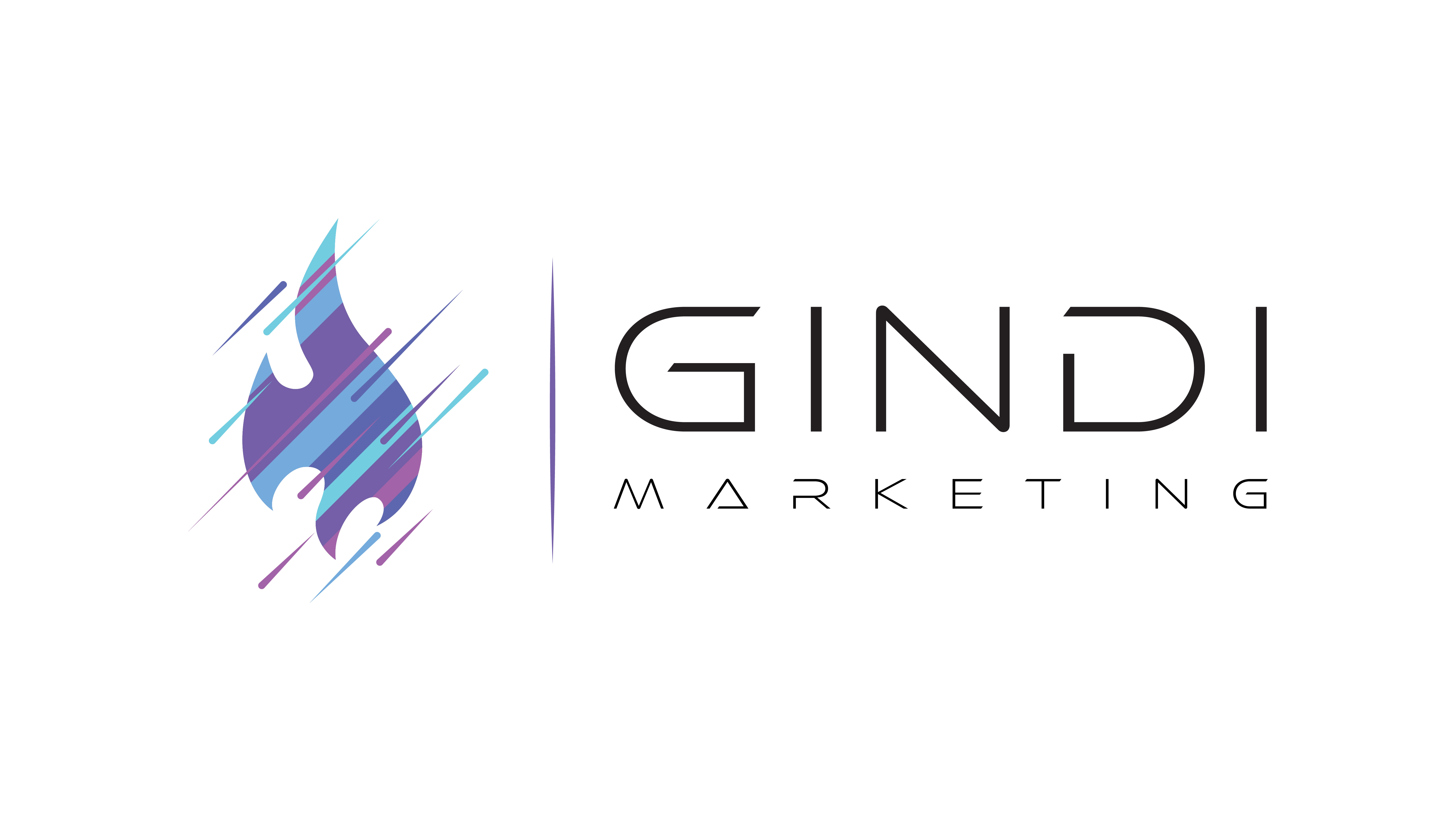
This is the logo created for Gindi Marketing. Gindi Marketing is a marketing partner that specializes in developing relationships. The Gindi Marketing team creatively facilitates connections between their clients and members of their clients’ target markets. When the owner Mark Gindi was describing his vision for the logo he told me to keep these things in mind. “Minimalism. Dichotomy. Opposites. Extremes and the space between them. Similar to water and fire, a combination or correlation of the two.”
EMPRESS TATTOO
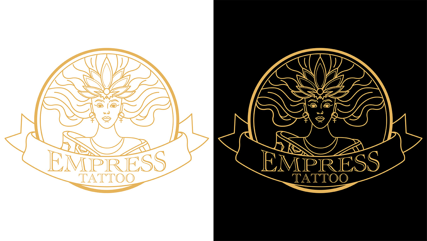
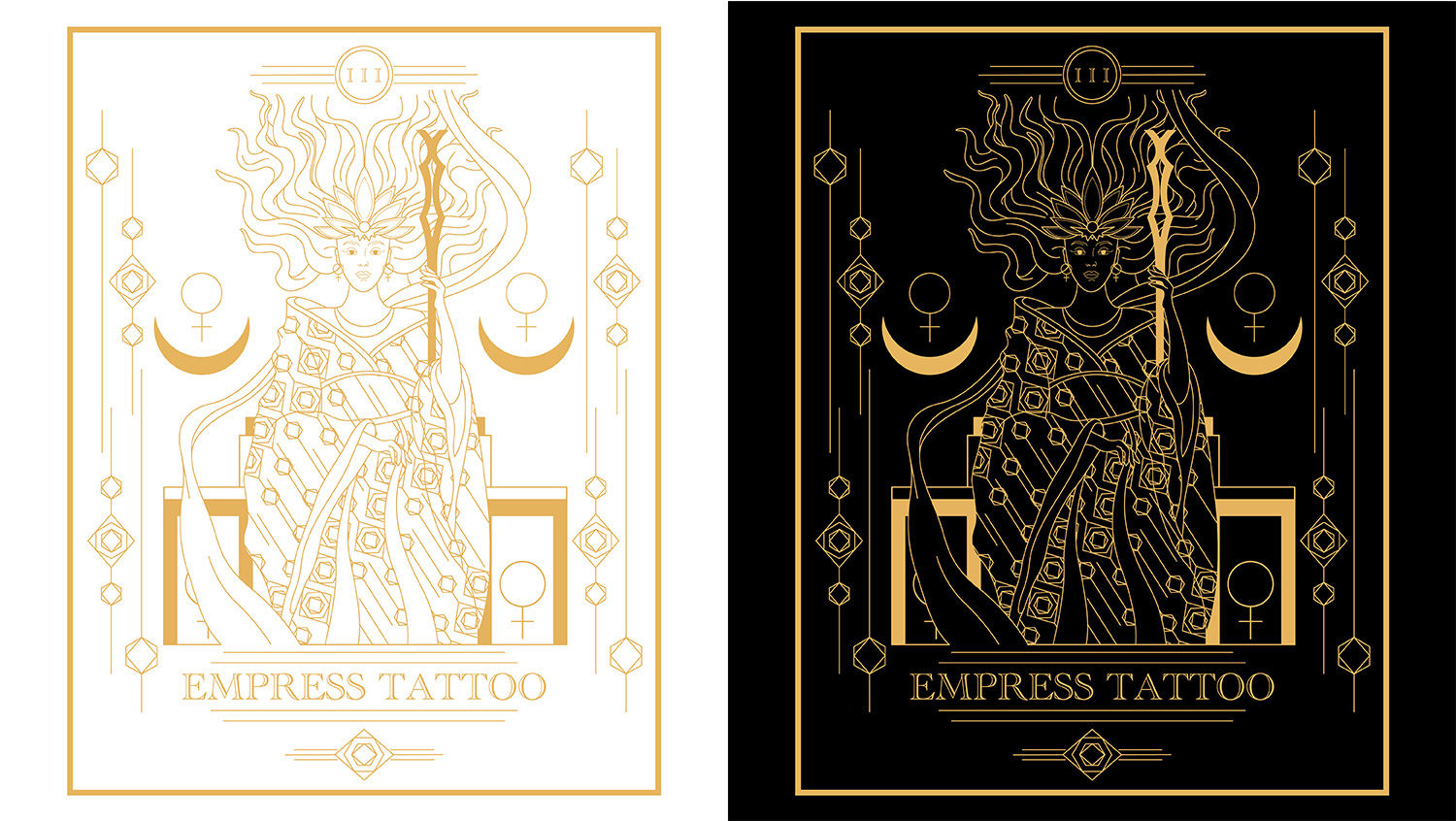
This is the logo and original tarot card I created for Empress Tattoo. Empress Tattoo is owned and operated by Eunice Lunsford in Chattanooga, TN. Eunice was working for another local tattoo shop when the Covid-19 pandemic began and all nonessential businesses in the city were closed. She embraced a difficult situation and decided to focus on her dream of opening a private studio. After many months of planning, Empress Tattoo was born.
When talking with Eunice about her history, artwork, and vision for the shop. We started to discuss the meaning behind the name of the shop. The "Empress" is based on the empress tarot card. After our conversation I knew she needed something very special for her shop's branding. Here are the final designs.
CHILL ONE HOUR
Chill One Hour Integrated Massage is owned and operated by licensed massage therapist Shawn Clouse. Shawn sees massage as an opportunity to help you achieve a healthy and well balanced life. He sees a “chill one hour” of massage as a vital ingredient to wellness.
In his words “I founded Chill One Hour Integrated Massage because I have a strong desire to help others find body awareness and a path forward to better health. I have a style that is intuitive, caring, and well informed so I can better help you reach your goals.”
For the logo process I wanted to represent balance, calmness, and wellness. In order to do so I used shades of blue and gray for the color palette. For the shape I went with a round shape with many panels and parts that create it. Those shapes and panels represent the many parts of life and elements that go into maintaining a healthy and well balanced life.
EMU ARAGON
Emu Aragon (he/him) is a national certified counselor and licensed professional counselor in Tennessee specializing in the treatment of relational/complex trauma. Emu approached me about a branding project. He said he would like to take the opportunity at this point in his career to create a brand for himself. He wanted a logo that he could take with him in whichever direction he went. He wanted a logo that embodied himself.
When describing what he envisioned for the logo he said: “My thought is the logo/brand name could be one in the same. If you have my last name Aragon in minimalistic but elegant typography and then an actual Emu in the design that could imply my first name. Idk, something like that. I also really like the use of negative space for either the emu or the letters of Aragon.”
I loved this idea and ran with it. Because of his profession I felt a serif font would be a good choice. It could represent a solid structure. Something bold yet soft and rounded that would provide a welcoming feel. For the emu itself I wanted to adopt the same characteristics from the typeface. Bold, strong, and rounded. I also wanted to make the emu a bit abstract. I wanted to use negative space to create the abstractness while also freeing up weight from it so it didn’t take too much away from the typeface.
JOSHUA'S TREES ARBOR SERVICES
Owned and operated by Josh Beers, Joshua’s Trees is a local arbor service company based out of Chattanooga. Josh specializes in all of your arborist needs and is ISA certified. His services include tree healthcare, planting, pruning and removal, contract climbing, firewood, ornamentals, and more. Give his page a follow and keep him in mind for any of your arborist needs. He is genuine, kind, and professional. It was a pleasure working with him on this branding project.
Some information behind the design: For the logo design he wanted something simple, modern, and digestible. We wanted to create something that matches the vibe of the arbor industry yet stands out. That is why instead of using the traditional green we went with a burnt orange color inspired by the retro color scheme associated with the 70’s. For the dogwood leave we went with a simple, modern, elegant design that represents his professionalism and diversity since he offers more than the usual arborist.
MOORE INDUSTRIES
Moore Industries is a landscaping and lawn care service company based out of Chattannoga,TN.
CRAFTS BY CONNOR
This is the logo created for Crafts by Connor. Crafts by Connor is a custom woodwork shop in Chattanooga owned and operated by Connor Sims. I was so excited to have the opportunity to bring this idea for his company’s logo to life. Connnor had the idea of having a topographical map of Chattanooga put inside a log. I loved the idea and started working on it right away. So excited about how this turned out and so excited about having a client with such a creative idea!
CONSISTENT-C WINDS
This is the logo created for Consistent-C Winds. Consistent-C Winds is a instrument sales and repair store in Chattanooga, TN. They have been in business for almost 20 years, and over that 20 years they have had the same logo and signage. When I was contacted by the owner Jonathan he expressed how he wanted to keep the new design as close to the original logo as much as possible. This is what we came up with.
HYPERION ARBOR SERVICES
This is part of the logo package created for Hyperion Arbor Services, a local tree service company based out of Chattanooga. Hyperion is owned and operated by Chris Broecker who has been in the tree service industry for 4 plus years.
Some information behind the design: for those of you who don’t know, Hyperion is the name of the tallest living tree in the world located in California. While designing this logo package Chris wanted me to recreate an image of Hyperion for the design, while also keeping the look clean and simple. Here is the finished product, enjoy and share
HALE QUARRIES
This is another rebranding project done for Jayson Hale who is the co-owner of Hale Quarries in Crossville, TN. Jayson contacted me about recreating the logo, he sent me a picture of his current logo and sent me some ideas of what he had in mind for the new one. He wanted a more modern and stylish design he could use for the company hats, t-shirts, and signage. Here are a couple different color schemes of the finished product.
SWEET ROSIE'S BAKERY AND CATERING
This is a part of the logo package created for Sweet Rosie's Bakery and Catering. Their company was started in South Lake Tahoe, California. When the owners of the company moved their home and business up to Sandpoint, Idaho they decided to partner with us to recreate their brand. Above is the linear logo used for their signs and business cards and the sticker kit used for the packaging of all of their baked goods.
ADAPT COSMETICS
This is the logo created for Adapt Cosmetics, a local shampoo company based out of Chattanooga. The company reuses/refills the shampoo bottles they use for their products. We kept that in mind while creating the logo and focused on a clean and eco-friendly look for the company.
ASYLUM SALON
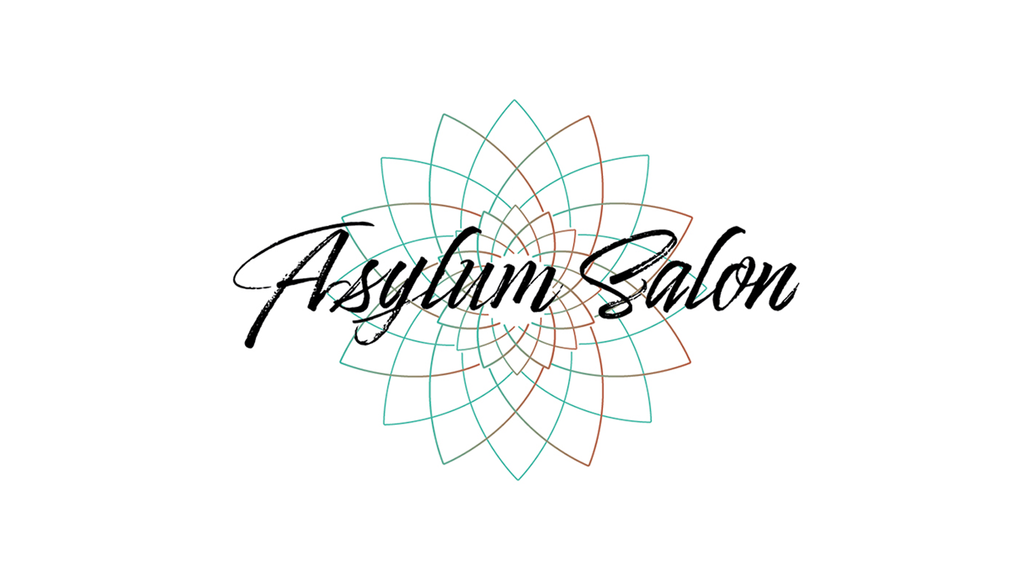
This is part of the design package created for the Asylum Salon in Crossville, TN. The Asylum Salon has been owned and operated by Janet Manning for almost 20 years now. In 2001 she opened the doors to her business and she has stayed loyal to her clients and true to her values and professionalism ever since. Since 2001 she has remained at the same location on Peavine Road. Over the last year, she has had her salon completely remodeled to provide an exceptional experience for all of her clients.
It only seemed right for her logo and brand to have some remodeling done as well. While creating her new logo we wanted to create a design that symbolized what the Asylum Salon is, a peaceful, elegant, personal, and professional hair salon.
BELLA BRONZING
This is part of the logo package created for Bella Bronzing. Bella Bronzing is an airbrush spray tanning company owned and operated by Teo Branum Saylors in Crossville, TN. Her home base is inside of Pure Hair Studio, but she is also mobile.
While creating this logo package we wanted to create a simple yet elegant and beautiful design with somewhat of a sunburst effect with a bronze, sun-kissed color. After nailing down the design we created a few different versions of it for different purposes such as signs, business cards, and t-shirts.
